F37 Britain sans Light
A collection of seven colourful, characterful fonts that take their cue from a miscellany of Britishness.
That’s pretty hard to put your finger on. Because the nation’s peculiar visual vernacular comprises thousands of small quirks and nuances. Many of these are so commonplace they go virtually unnoticed — they’re around us on the streets, our homes, objects that we pick up and use every day. We take them for granted, they’re just part of the national socio-cultural landscape.
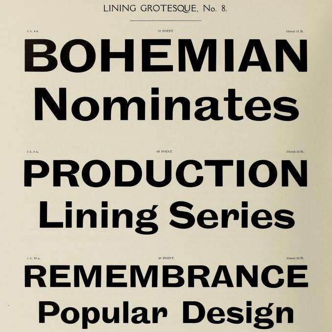
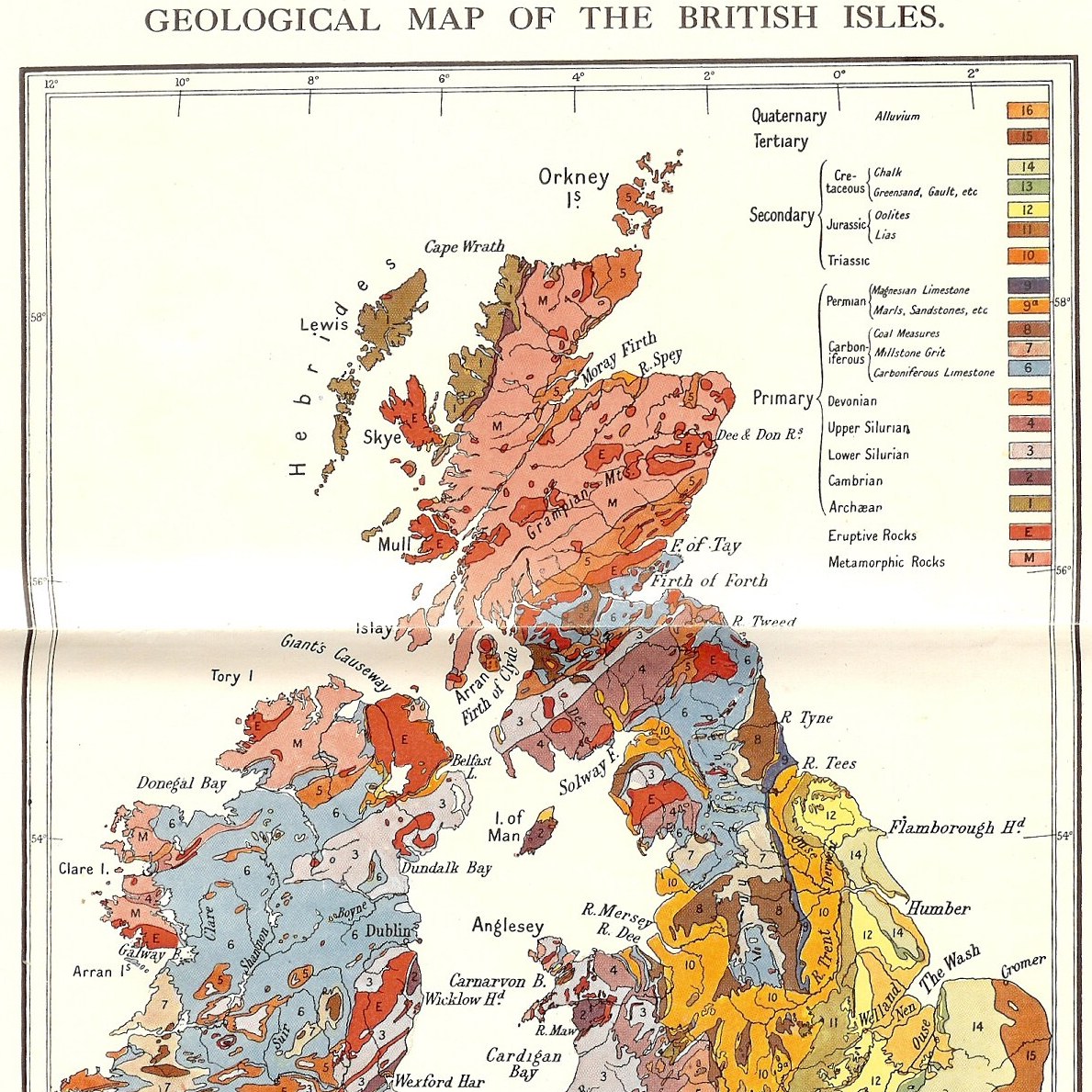
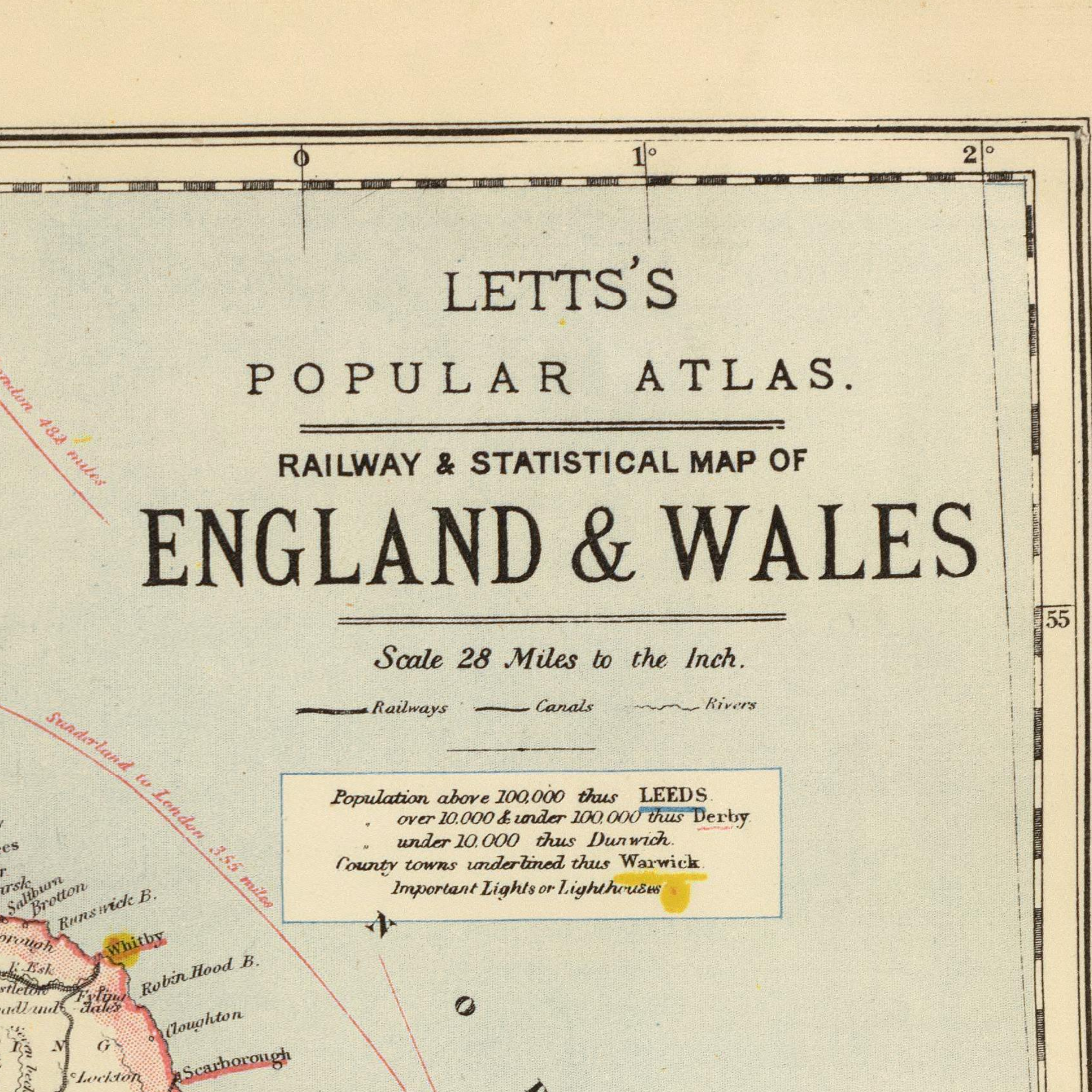
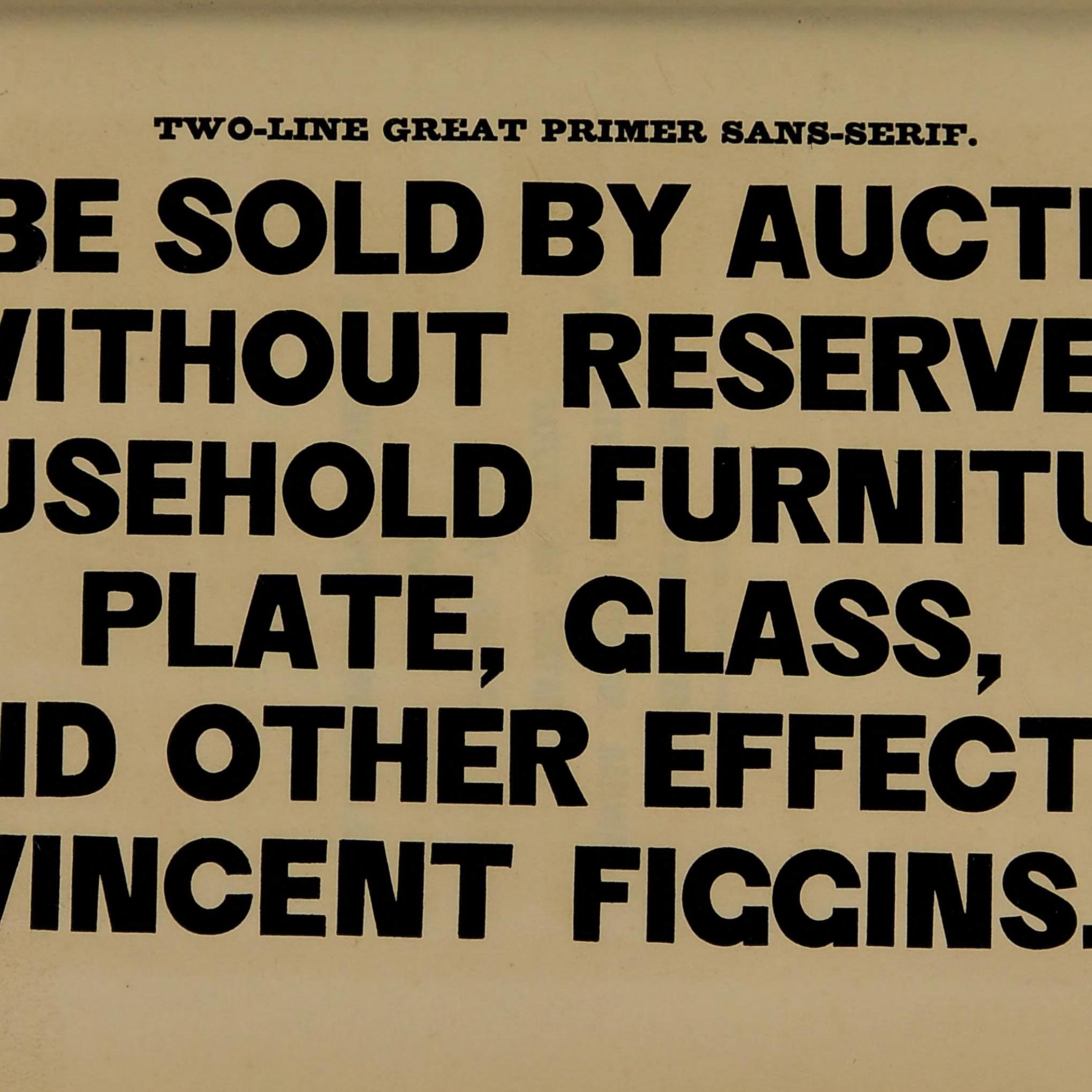
This was the idea behind the F37 British Collection, a collection of seven disparate but perfectly patriotic fonts. We’ve taken our inspiration from all nooks, corner and crannies of the land — from Victorian theatre posters and antique maps, to wood-type specimens and Leicestershire typewriter impressions. We’ve paid homage to John Baskerville, the father of transitional typography and Edward Johnston, the man who took letterforms Underground. We’ve referenced the Union flag and Scotch whiskey, classic serifs and ever-popular sans serifs.
F37 Britain sans Black
A collection of seven colourful, characterful fonts that take their cue from a miscellany of Britishness.
That’s pretty hard to put your finger on. Because the nation’s peculiar visual vernacular comprises thousands of small quirks and nuances. Many of these are so commonplace they go virtually unnoticed — they’re around us on the streets, our homes, objects that we pick up and use every day. We take them for granted, they’re just part of the national socio-cultural landscape.
This was the idea behind the F37 British Collection, a collection of seven disparate but perfectly patriotic fonts. We’ve taken our inspiration from all nooks, corner and crannies of the land — from Victorian theatre posters and antique maps, to wood-type specimens and Leicestershire typewriter impressions. We’ve paid homage to John Baskerville, the father of transitional typography and Edward Johnston, the man who took letterforms Underground. We’ve referenced the Union flag and Scotch whiskey, classic serifs and ever-popular sans serifs.
F37 Britain sans Light
A collection of seven colourful, characterful fonts that take their cue from a miscellany of Britishness.
That’s pretty hard to put your finger on. Because the nation’s peculiar visual vernacular comprises thousands of small quirks and nuances. Many of these are so commonplace they go virtually unnoticed — they’re around us on the streets, our homes, objects that we pick up and use every day. We take them for granted, they’re just part of the national socio-cultural landscape.
This was the idea behind the F37 British Collection, a collection of seven disparate but perfectly patriotic fonts. We’ve taken our inspiration from all nooks, corner and crannies of the land — from Victorian theatre posters and antique maps, to wood-type specimens and Leicestershire typewriter impressions. We’ve paid homage to John Baskerville, the father of transitional typography and Edward Johnston, the man who took letterforms Underground. We’ve referenced the Union flag and Scotch whiskey, classic serifs and ever-popular sans serifs.
F37 Britain sans Regular
A collection of seven colourful, characterful fonts that take their cue from a miscellany of Britishness.
That’s pretty hard to put your finger on. Because the nation’s peculiar visual vernacular comprises thousands of small quirks and nuances. Many of these are so commonplace they go virtually unnoticed — they’re around us on the streets, our homes, objects that we pick up and use every day. We take them for granted, they’re just part of the national socio-cultural landscape.
This was the idea behind the F37 British Collection, a collection of seven disparate but perfectly patriotic fonts. We’ve taken our inspiration from all nooks, corner and crannies of the land — from Victorian theatre posters and antique maps, to wood-type specimens and Leicestershire typewriter impressions. We’ve paid homage to John Baskerville, the father of transitional typography and Edward Johnston, the man who took letterforms Underground. We’ve referenced the Union flag and Scotch whiskey, classic serifs and ever-popular sans serifs.
F37 Britain sans Bold
A collection of seven colourful, characterful fonts that take their cue from a miscellany of Britishness.
That’s pretty hard to put your finger on. Because the nation’s peculiar visual vernacular comprises thousands of small quirks and nuances. Many of these are so commonplace they go virtually unnoticed — they’re around us on the streets, our homes, objects that we pick up and use every day. We take them for granted, they’re just part of the national socio-cultural landscape.
This was the idea behind the F37 British Collection, a collection of seven disparate but perfectly patriotic fonts. We’ve taken our inspiration from all nooks, corner and crannies of the land — from Victorian theatre posters and antique maps, to wood-type specimens and Leicestershire typewriter impressions. We’ve paid homage to John Baskerville, the father of transitional typography and Edward Johnston, the man who took letterforms Underground. We’ve referenced the Union flag and Scotch whiskey, classic serifs and ever-popular sans serifs.
F37 Britain sans Extra Bold
A collection of seven colourful, characterful fonts that take their cue from a miscellany of Britishness.
That’s pretty hard to put your finger on. Because the nation’s peculiar visual vernacular comprises thousands of small quirks and nuances. Many of these are so commonplace they go virtually unnoticed — they’re around us on the streets, our homes, objects that we pick up and use every day. We take them for granted, they’re just part of the national socio-cultural landscape.
This was the idea behind the F37 British Collection, a collection of seven disparate but perfectly patriotic fonts. We’ve taken our inspiration from all nooks, corner and crannies of the land — from Victorian theatre posters and antique maps, to wood-type specimens and Leicestershire typewriter impressions. We’ve paid homage to John Baskerville, the father of transitional typography and Edward Johnston, the man who took letterforms Underground. We’ve referenced the Union flag and Scotch whiskey, classic serifs and ever-popular sans serifs.